As an architect, I understand the appeal for texture and the luxurious sense that the color white imbues. Boucle had it’s moment, and now that the pristine of white has turned into 50 shades of “dirty white,” thanks to the many hands that could-not-help but be drawn to said texture, design enthusiasts now find themself rage cleaning their upholstered investment piece. Good luck, but I digress.
Today I bring up the “Greige.”
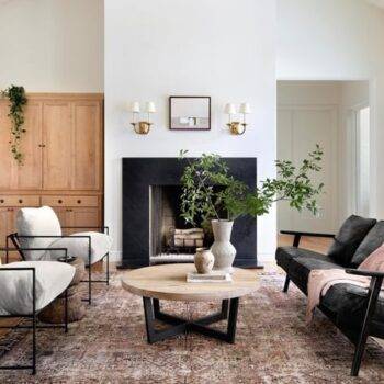
Now, some may not know about “Greige,” but there’s more to this trend than meets the eye. Greige is a neutral color that can be easily paired with other shades and textures. It’s versatile, and can be timeless, and sophisticated. Plus, it’s a great alternative to the starkness of white or the darkness of black.
But as usual, the phrase “too much of a good thing” pops in. The many hues of warm grey-slash-beige have many not only dressed head-to-toe with said color, but we now also find it everywhere wall-to-wall and floor-to-ceiling. No other color is allowed, which makes the occasional visitor stop and wonder exactly where they landed as they crossed the threshold. To add insult to injury, this trend has even been caught in small children’s bedrooms. We have gone from overwhelming blue and pink to underwhelming gender neutral monotony.
This is just an example of shooting for luxury and sophistication, but just ended with “Sad Baby.”
Let’s take three simple design tips to avoid Sad Baby Syndrome.
Pick a neutral (beige or grey), pick a complementary color, and add white for balance.
This is a sure fire way to have a calming neutral palette but also not loose interest in the room. Complementary natural tones like light blue or an earthy green play well with these base colors. Use these sparingly, but these also can be used to help bring in some biophilic design principles as well.
Less is more.
Whether it is inherently a strategy for chaos control with little ones, it is easiest to invest in a few quality pieces that are washable (think – slipcovers or zippered) upholstered pieces. Also, add some higher contrast in the same color palette. One of my favorite pieces is a versatile leather ottoman or pouf that will be used all and ages gracefully.
Opt for Beige instead of Grey.
Beige has some warm undertones that give it more life than a cooler grey. If you have been tuning into the reals estate market and visited local open houses, the continuous cool grey that has been sprayed throughout the house is want we call “Contractor Grey.” It is a successful color! It is neutral enough that potential buyers can appreciate the spaces, it hides bumps, scratches and scrapes on the walls well, and doesn’t give the cavernous appearance that white will have on an empty home.
But-
It is still colder and less inviting than the alternative.
Bonus: Take a brave stab at color.
Color is scary, but we are drawn to it for a reason. Imagine a bouquet of daisies next to a spray of tulips, lavender or roses. Use low-commitment color accessories to test out the harmony. I will use seasonal throws and pillows to brighten up a room and announce the changing seasons, or even to just match my mood. The point of having neutrals is that they are in the background, so that you, your personality and creativity, can shine.